art & design

In Between Spaces

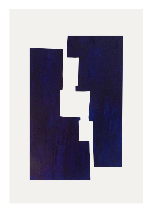
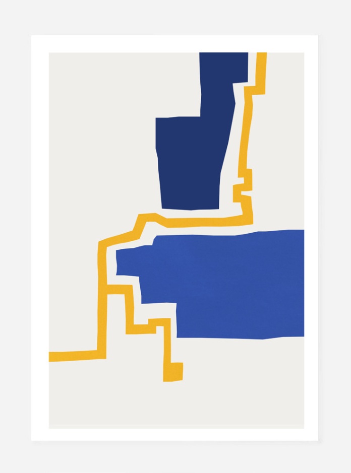
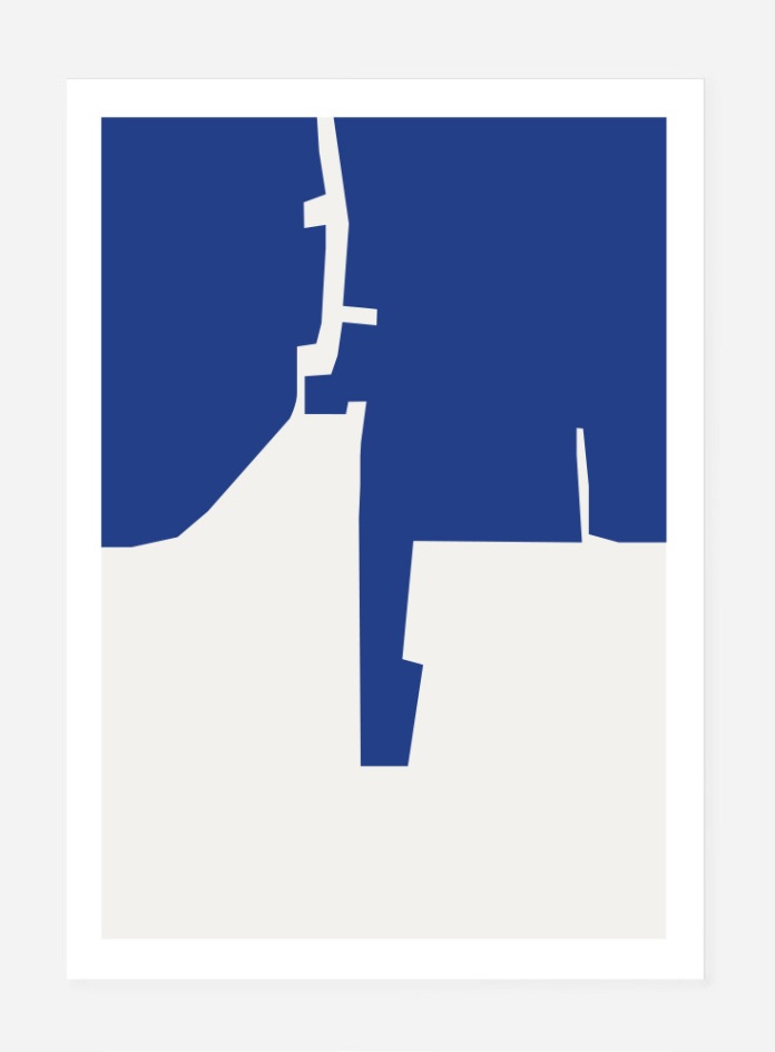
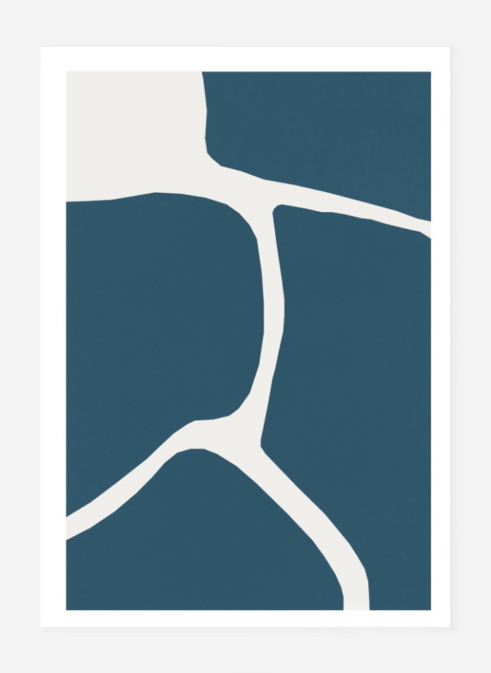
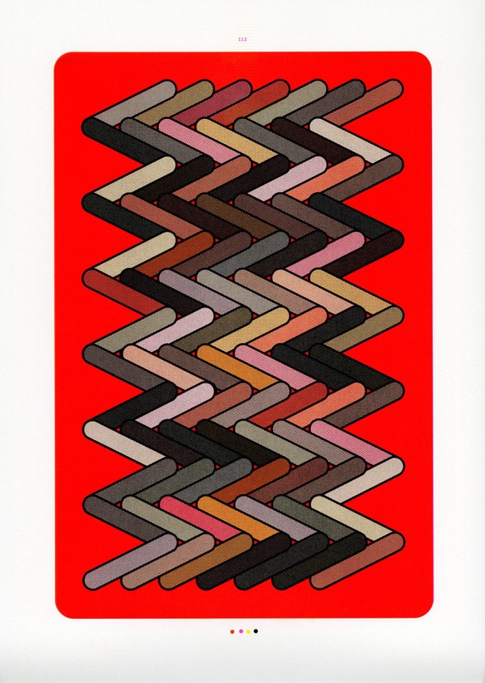
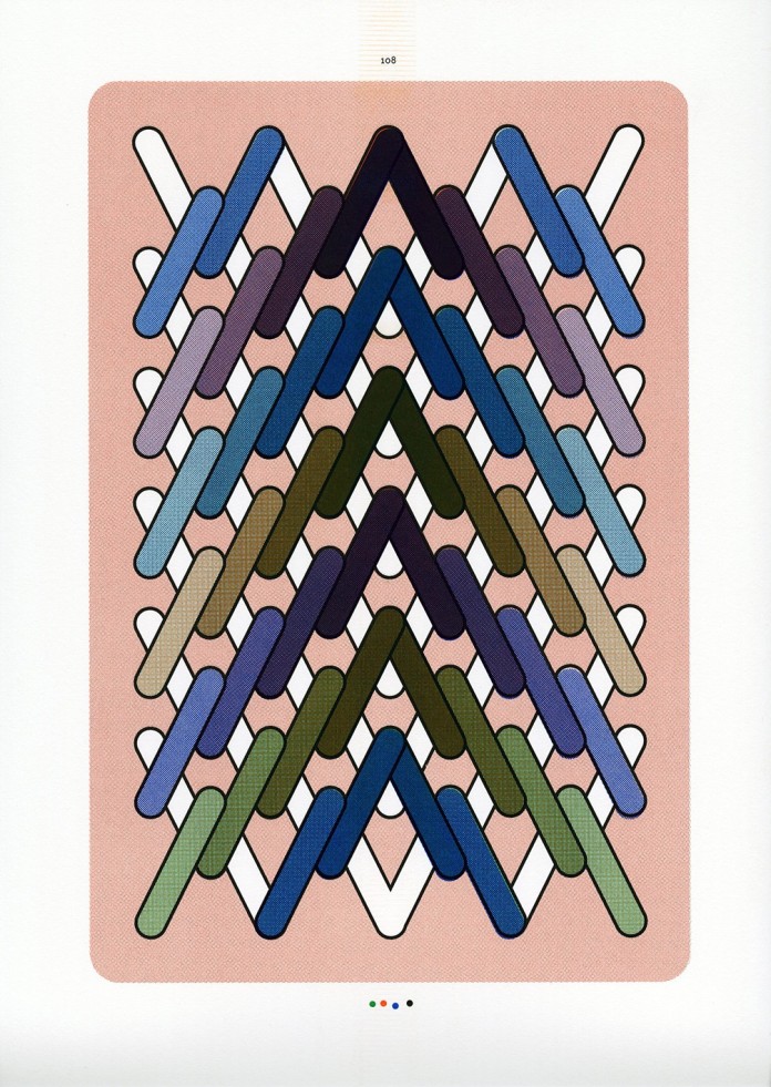
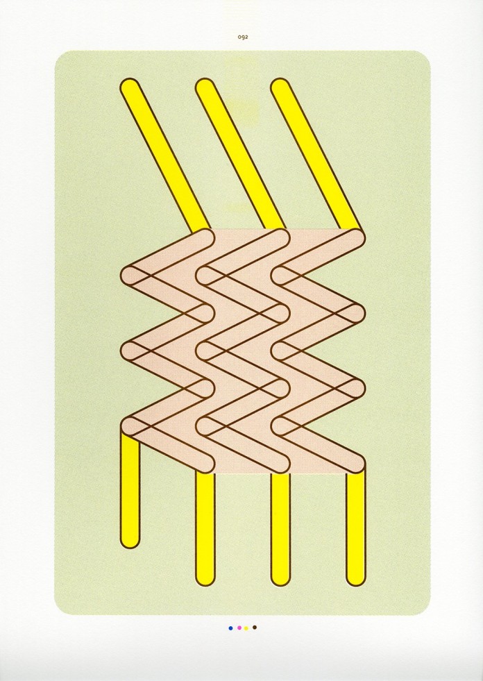
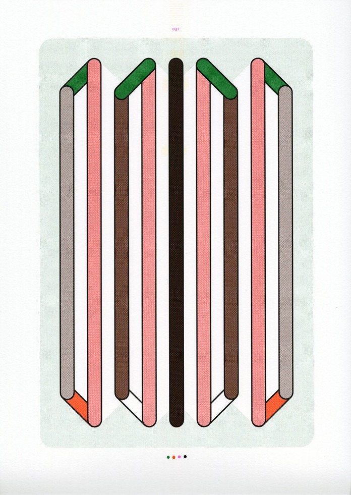
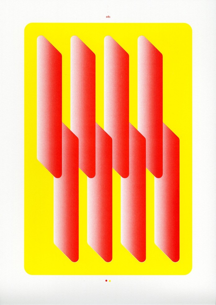
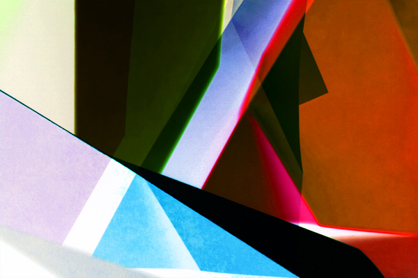
Caroline Sillesen is a Danish artist and illustrator creating beautiful, bold prints influenced by architecture, urban spaces, Russian constructivism, city street plans, and everyday structures. Her series “In Between Spaces” caught my eye at an art fair here in Copenhagen a few months ago, and I snatched up the yellow print below for our apartment walls. Go check out her site and get one for yourself.

Her words about the inspiration for the series:

“The series emanates from a fascination of the gap, the space in between spaces. The urban space, the  space between two buildings, the streets and the way they wind. Log book studies of the labyrinthine street structure of Venice acted as a catalyst and the main theme for the creation of the works. The experience through the city’s tortuous street web, a reconstructed plan, the atmosphere from a place.”
caroline_sillesen_yellowcaroline_sillesen_blue

Art06_web_1465

caroline_sillesen_1465

caroline_sillesen_Art08_web_1465

Standard
art & design

Sigrid Calon’s Riso Stitches

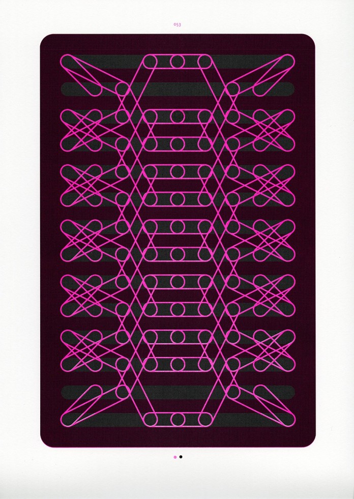
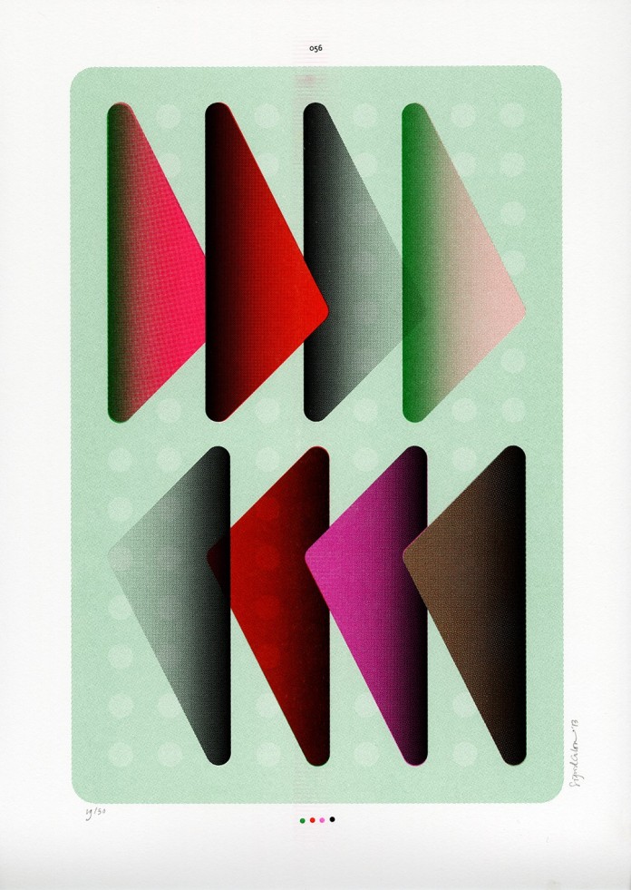
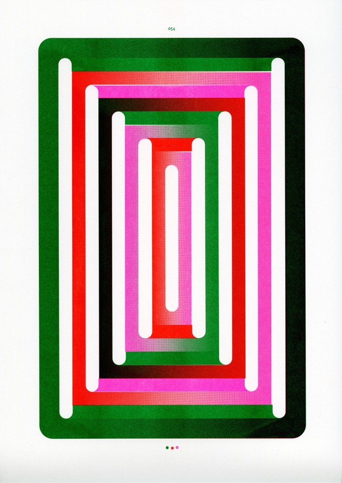
I first learned about Dutch designer and visual artist Sigrid Calon via Sight Unseen – their Instagram, to be exact. I pretty much love everything they feature on their site, and the risoprint of Calon’s they put up instantly had me searching for more of her work.

The print is actually part of a larger series she created based on stitched embroidery patterns. With its set amount of holes and rows, an embroidery grid can hold eight different types of stitches. To honor the craft and intense manual process of embroidery, Calon starts off with a stenciling technique and moves to the computer. When processed digitally, the stitches become lines that can then combine, repeat, join and layer to create endless graphic combinations. Color and gradients mix to create an intriguing sense of depth and displacement. It’s a wonderful kaleidoscopic world where order and pattern meet possibility.

She turned 120 of the prints into a book and has dozens available in her online shop.

I ordered two for the walls and ogled the rest.

sc_1 sc_6 sc_3 sc_5 sc_8 sc_7 sc_4 sc_2

Standard
art & design, denmark, photos

FINDERS KEEPERS’ Keepers

FINDERS KEEPERS held their recurring indoor design market here in Copenhagen over the weekend. Nearly 300 booths from independent creators were packed with print, textile, jewelry, ceramic, furniture, and clothing design. It’s a cozy, if slightly overwhelming event, with food and music and tons of cool stuff to pour over.

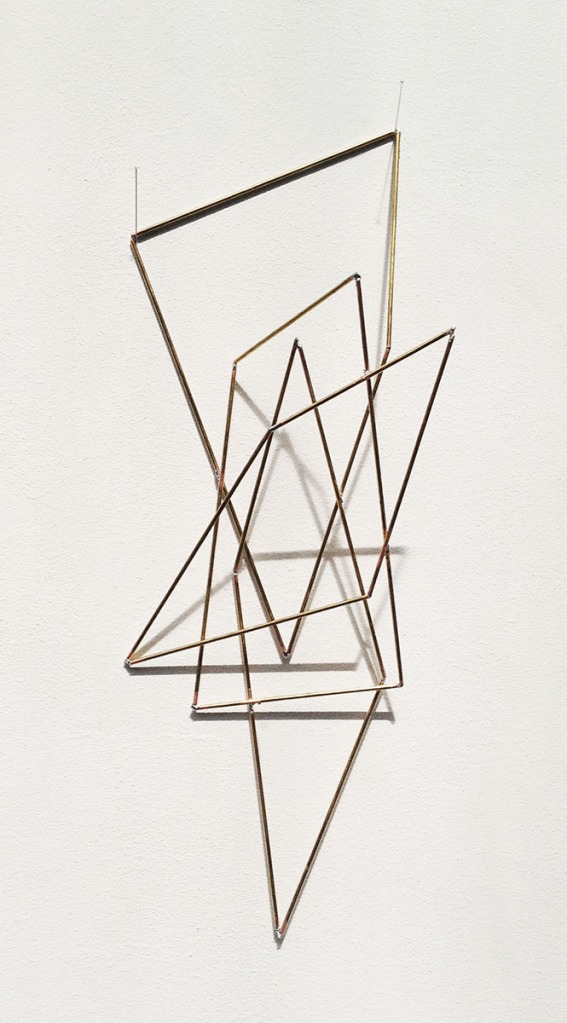
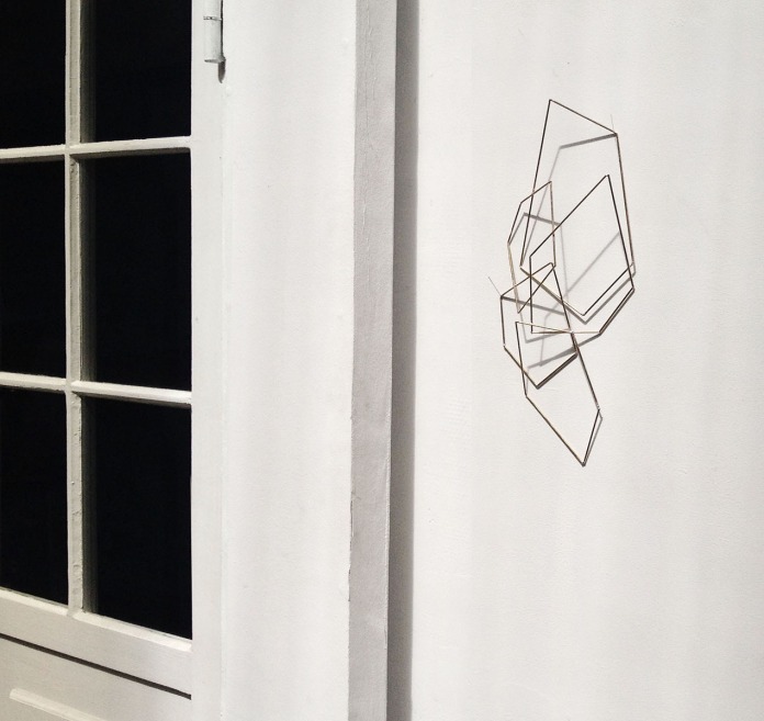
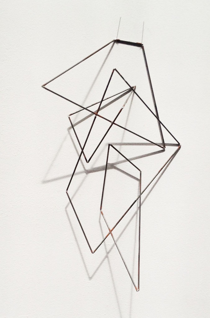
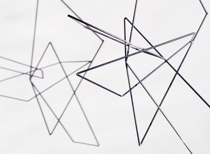
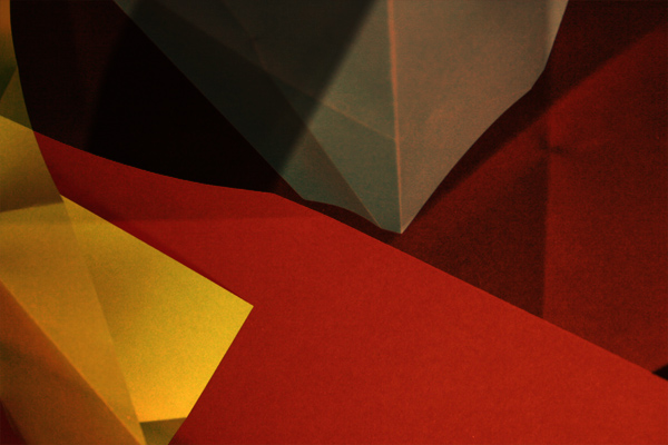
Highlights for me were these wonderful sculptures from the studio of architect and visual artist Tina Louise Hunderup. So simple and clean in form, the shapes can be placed to sit on tables or hang on the walls, where they cast moving shadows when the light hits just right. According to Tina Louise, each sculpture is an abstraction of different architectural constructions and terms. I’m still kicking myself for not buying one.

TL_2 TL_1 TL_3 TL_4

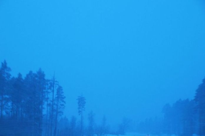
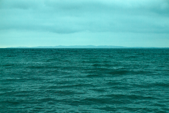
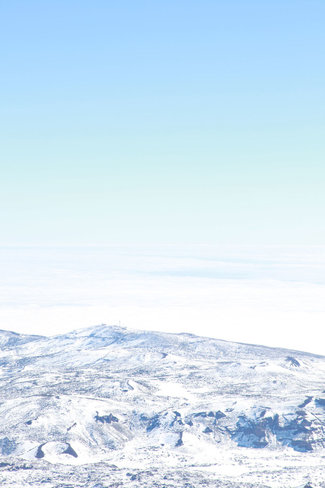
Another artist that caught my eye was photographer Helle Sandager. She was selling a bunch of bold, beautiful prints of photos from a series called Wild Nature. What I love about these is that it’s a pretty simple concept, but it has to be executed just right. Nature exposed and manipulated so slightly that it adds this kind of otherworldly, foreign layer on top something you’ve seen a million times.

Blue_Nights

Fading_Forest

Mold_Mountain

Green_Ocean

TheLonelyMountain

land_above_skies

Standard
art & design

Phenakistoscopes, Zoetropes, & Praxinoscopes, Oh My!

Today I was doing some research & brainstorming with my work crew for one of our Clients. I won’t go into details of the brief, but the conversation was focused on creating something physical to celebrate/honor something digital and video-based. Obviously this isn’t groundbreaking territory, and the outcome is still very much a work in progress, but it brought some nice topics into discussion.

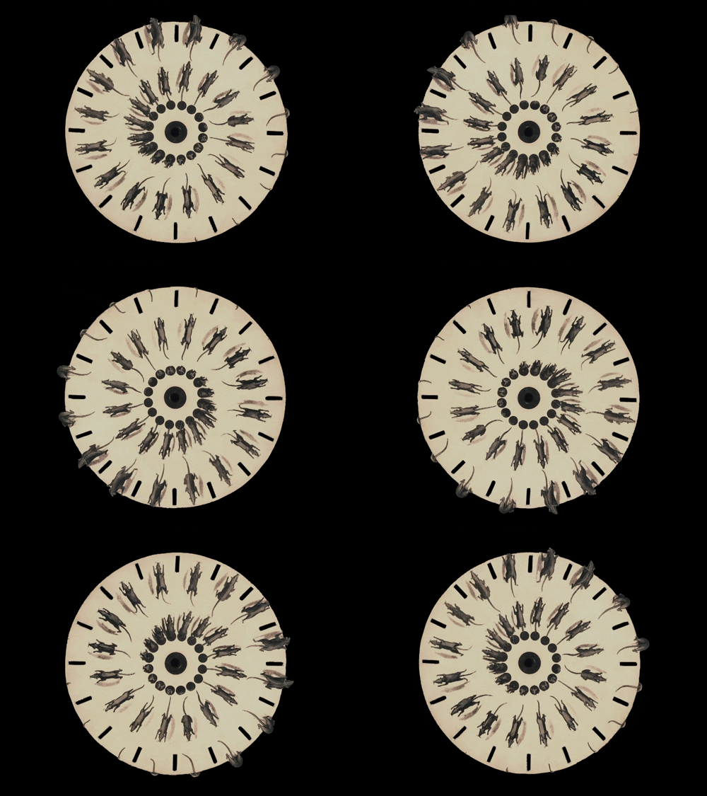
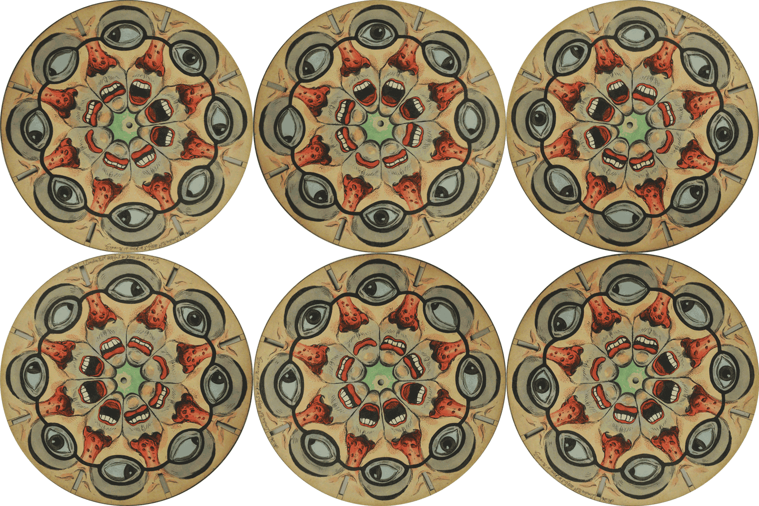
One of which was the evolution of the phenakistoscope. The ‘original animated GIF’ has enjoyed some recent posting love so I won’t simply regurgitate the nice collections Juxtapoz and This is Colossal have already put out into the world.  Ok fine, here’s a small taste: 

rats_phenakistoscope

faces_phenakistoscope

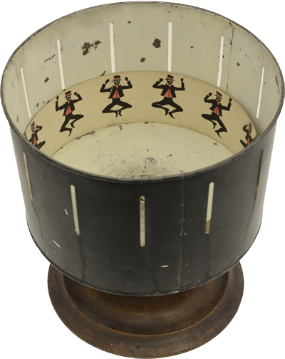
A quick history sum-up: the phenakistoscope, zoetrope, and praxinoscope were all ‘pre-animation’ devices that created the illusion of motion by displaying rapid sequences of drawings or photos. They’re all essentially versions of the same concept, just altered and improved over time. A Belgian physicist named Joseph Plateau is credited with inventing the first phenakistoscope device, but there were a lot of scientists, mathematicians, and such working on the same idea at the same time. 

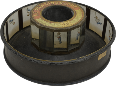
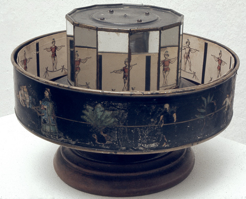
The end results are obviously nice, but the most interesting part to me was looking back at the devices themselves. Metallic, merry-go-round cake-pan wonders.


praxinoscopePraxinoscopezoetrope 

Standard
art & design, photos

Between Sleeping and Waking

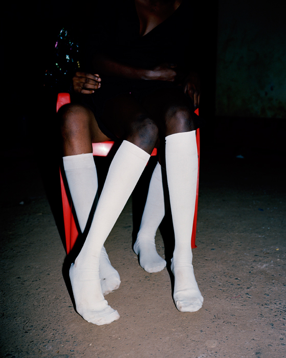
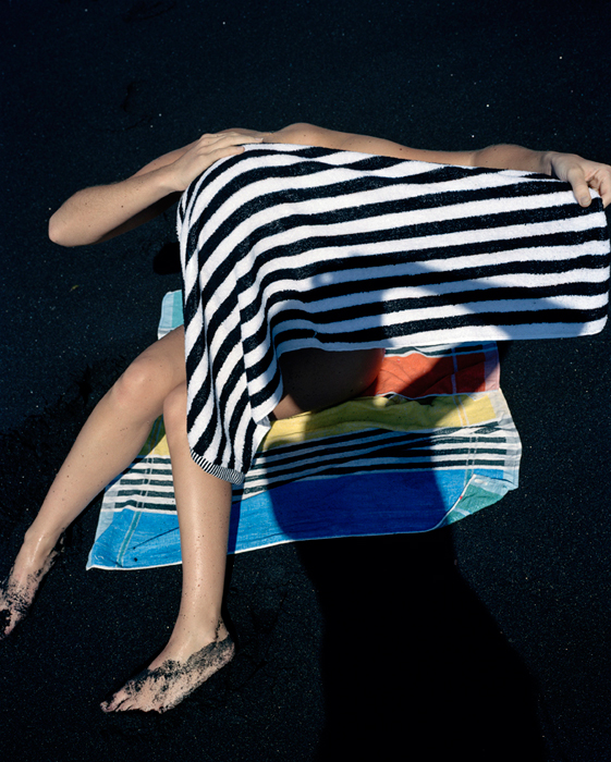
I visited MoMa’s annual New Photography update last week and was a bit mesmerized by the latest work from Netherlands-based artist Viviane Sassen.

Born in Amsterdam, Sassen spent part of her formative childhood years in Kenya. As an adult she returned to Africa to try and recapture the dreamy, surreal impressions of her youthful days on the continent. The resulting series is called Parasomnia and it’s filled with bold spots of color, sharp angles and dramatic, shadowy lines. Anonymous places and mostly faceless subjects give the work a hypnotic blend of both mystery and intimacy.

Standard
art & design, sports

My Guardian

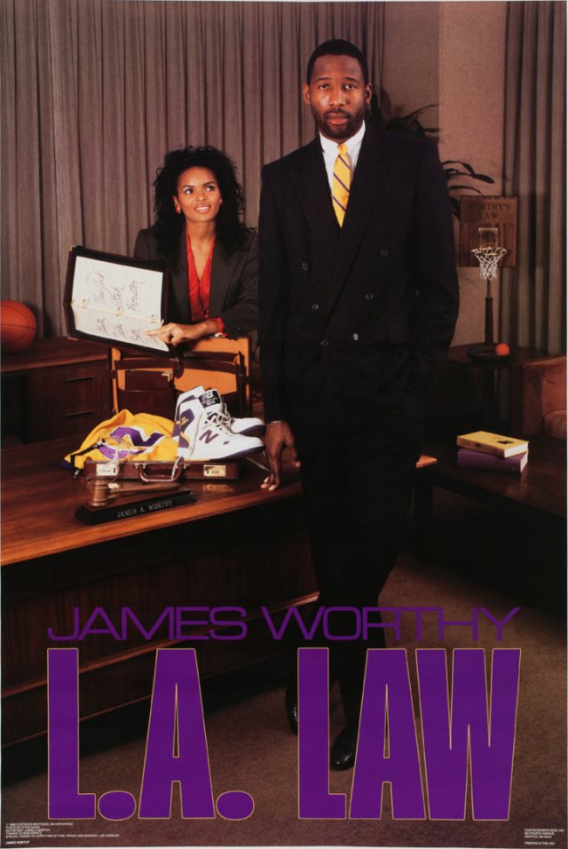
I was flipping through the latest issue of Juxtapoz and nearly laughed out loud when I came to their coverage of For the Kids, a recent Salon 94 exhibition of the infamous late-1980s sports posters of brothers John and Tock Costacos. To refresh your memory, the posters took various basketball, baseball and football stars of the day, dressed them up as street toughs, security guards, urban cowboys and superheroes and placed them against dramatic yet slightly low budget ‘sets.’ The images played off existing personas, like the classic version of Karl “The Mailman” Malone dressed up like a mailman, somewhat violently stuffing a basketball into a mailbox labeled The Boston’s. Others spun off the decades’s greatest pop culture hits – films like The Terminator and Mad Max…TV shows like LA Law and Miami Vice. They were kitschy, but they were unique. And they sold like hotcakes.

As a young girl I was obsessed with basketball and the New York Knicks. At age 10 I purchased and hung this poster directly over my headboard in the bedroom I shared with my sister.
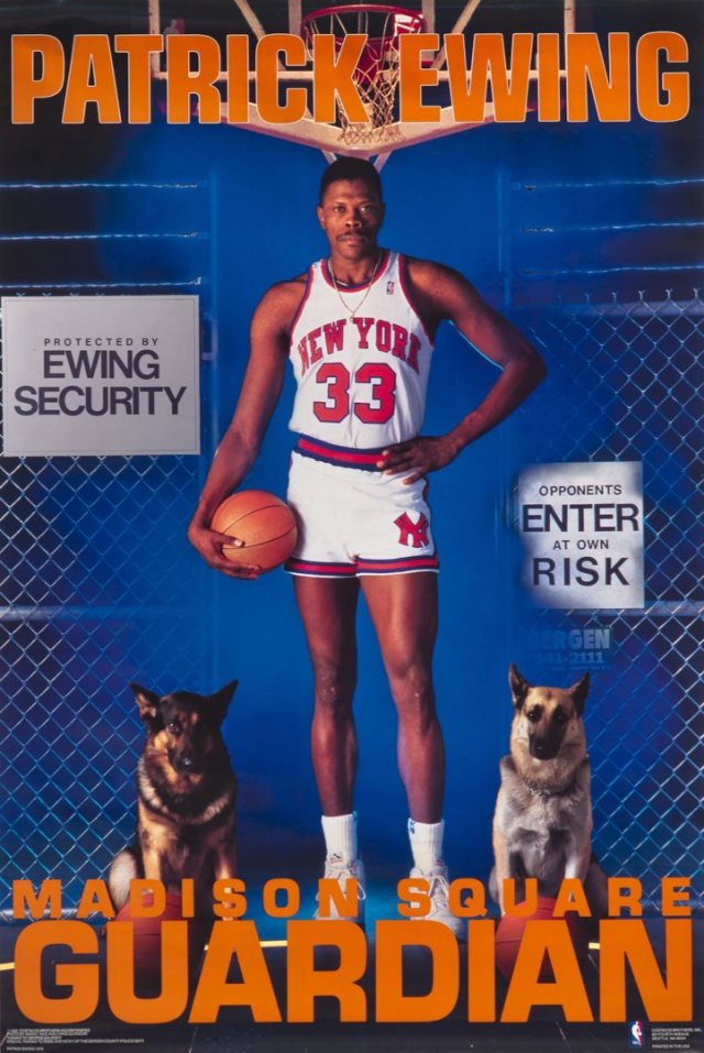
My mom complained about having to stare down a 7-foot stranger as she bent in for a goodnight kiss. My sister rolled her eyes and hung a Degas print, or something equally sophisticated, over on her side of the room. But I was unfazed. Patrick Ewing was my guardian.

As an adult I can laugh and appreciate the campy ridiculousness of these posters, but as a tiny-limbed, extremely passionate Knicks fan, I thought mine was the coolest, most badass image ever created.

The Costacos retrospective closed on August 7th – SO bummed I missed a chance to see Patrick framed and hung in a place of honor again. Full-circle life moment, missed. Oh well.

For a great look at all the posters, Lob Shots posted up an amazing collection.

Below are another few personal favorites, most of which have been chosen for the ‘best use of most silly prop.’

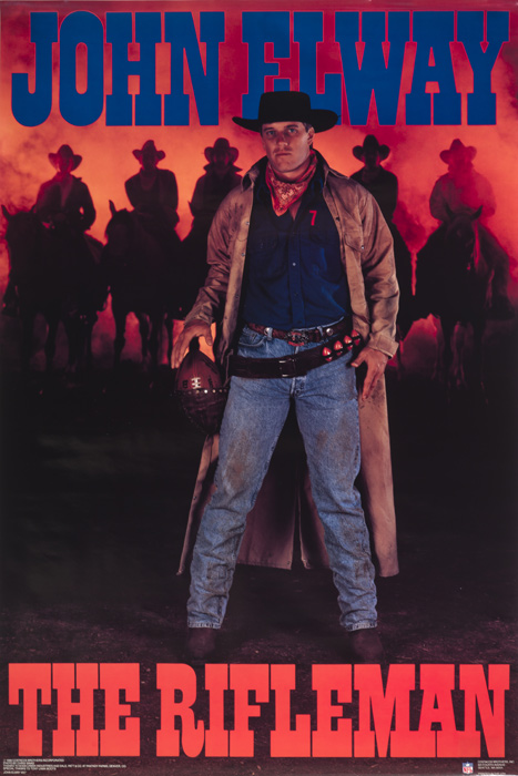
John Elway as “The Rifleman.” The football holster! Amazing.
Eric Davis as “Magnum.” Giant gun with baseballs in the chamber instead of bullets? Check. Plus this one is pretty much the visual equivalent of a local network tv infomercial. So good.

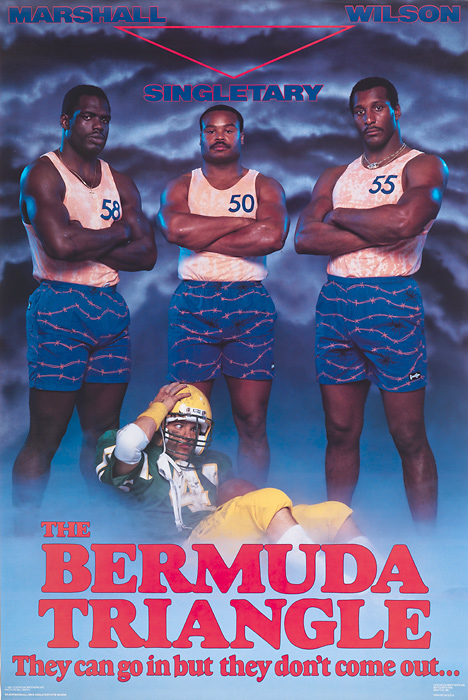
I have no idea who these guys are but the shorts and the tagline are winners.
James Worthy in LA LAW. So serious, yet so silly. Love his ‘sexy assistant’ and the office mini hoop.
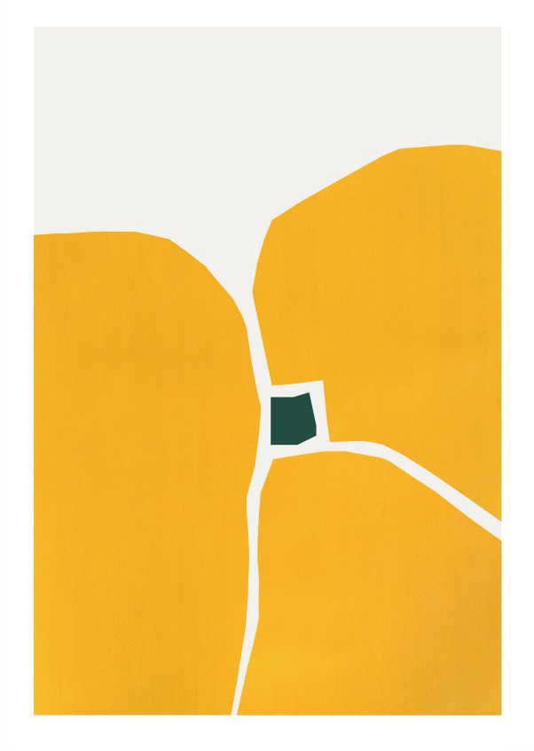
Standard
art & design, movies

The Future and The Hallway

Gearing up to see Miranda July’s latest film, The Future by poking around on her super entertaining personal site, which is filled with psychic interviews, random musings & jet-lagged video testimonials from her latest publicity tour…plus links, pictures and cool bits of info from some of her older art projects.
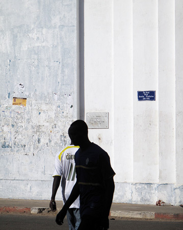
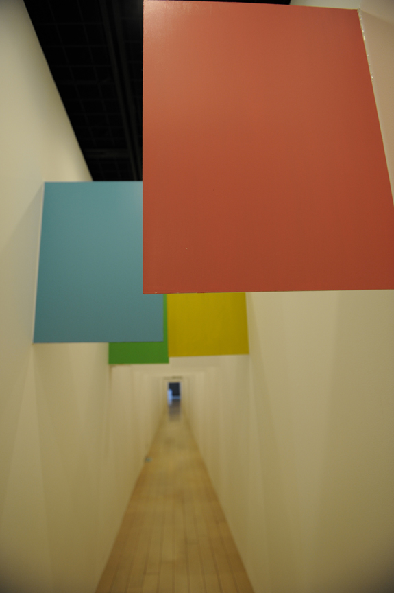
This 2008 piece called “The Hallway” was commissioned by the Yokohama Triennial. It made me laugh a lot.

Here’s the exhibition’s blurb:

A 125 foot hallway lined with fifty wooden signs, hand-painted with text. As the viewer/participant walks down the seemingly endless hall, weaving between the signs, the text acts as an internal voice, “It’s too late to go back now, but the end seems far away…” The “you” in text realizes that you’ll be walking down this hallway for the rest of your life. And like life, the hall is filled with indecision, disappointment, boredom and joy – and it does end.


The Hallway from The Hallway on Vimeo.

Standard
art & design, photos

Hail Ye Travelers

RWFA Gallery has an excellent exhibition up called Hail Traveler! The Photographer as Tourist, and the Tourist as Subject.

Inspired by the writings of J. B. Jackson, the show’s photos look to expose the curious, visionary tourist that resides in every photographer traveling in search of a subject.

One of Jackson’s influencing beliefs was that tourism is largely the desire to know more about the world in order to know more about ourselves. As RWFA points out, “his ideology parallels the careers of many photographers, and the concept of finding one’s vision through the exploration of the unfamiliar.”

Beautiful works by Jehsong Baak, Sharon Harper and John Goodman stood out for me. There’s also a striking Avedon portrait that no ‘image insert’ could do justice – go see it in person!

Standard